Ten formulas, one for each type of product you might sell — plus the single prompting habit that keeps colors, logos, and proportions accurate.
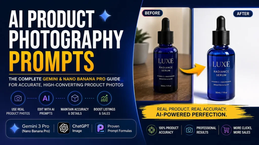
If you sell anything online, you already know the problem: your product is good, but your photos don’t show it. A phone snapshot on a kitchen counter doesn’t compete with a studio shot, and hiring a photographer for every SKU in a growing catalog isn’t realistic for most small sellers.
AI image tools have closed that gap faster than most sellers realize, but almost every guide to treats it the same way as generating a fantasy landscape: type a description, get a pretty picture. That approach breaks the moment real money is involved. A customer isn’t buying a pretty picture — they’re buying the literal object in the photo, and if the AI quietly changes its color, its logo, or its proportions, you’ve created a returns problem, not a sales tool.
This guide is built around that distinction. Every formula below is written for image-editing tools like Gemini 3 Pro Image (Nano Banana Pro) and ChatGPT’s image tool, where you upload a real photo and the AI edits around it rather than inventing from scratch — and instead of one generic prompt, you’ll get a separate, purpose-built formula for jewelry, apparel, bottles, cosmetics, footwear, food, electronics, furniture, and more, plus exactly what to change to make each one work on a product it wasn’t written for.
Discover more👇
Gemini AI Photo Prompts for Studio-Quality Images with Nano Banana Pro
Gemini AI Photo Editing Prompts Guide for Realistic Results
The Quick-Answer Prompt
If you want to quickly try, then you can try this. It’s a general-purpose e-commerce hero shot template built for image-to-image editing — meaning you upload a real photo of your product first, and the AI edits around it rather than reinventing it.
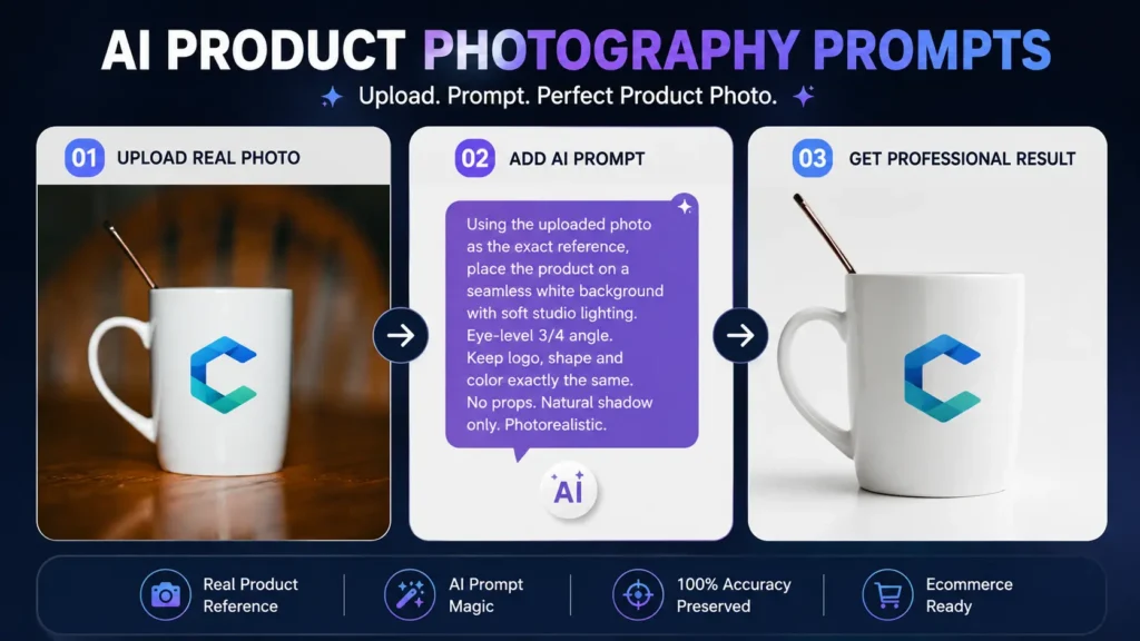
Using the uploaded photo as the exact reference for the product’s shape, color, material, and label details, place it on a seamless white background under soft, even overhead studio lighting with a gentle front fill to keep shadows soft. Shoot from eye level at a slight three-quarter angle so the main label is fully readable. Add a soft, natural contact shadow directly beneath the product only. No props, no added text, no watermark, no reflections beyond what the material would naturally produce. Photorealistic e-commerce product photography, sharp focus across the entire product, 1:1 aspect ratio.
Treat this as the base layer. The category formulas further down show you exactly what to swap for your specific product — and how to keep swapping it for products that aren’t on this list at all.
Why Product Photography Prompts Work Differently Than Every Other Kind of AI Art
With most AI art — portraits, landscapes, fantasy scenes — “convincing” is the whole goal. Nobody checks a generated mountain range against the real mountain. Product photography flips that: the image has one job, which is to represent, with total accuracy, an object a stranger is about to pay for sight unseen.
That changes what a good prompt looks like. A landscape prompt rewards vivid, imaginative language. A product prompt rewards restraint — the goal is to describe what’s already true about your product so precisely that the AI has no room to improvise. Every formula in this guide is built around closing off that room to improvise, because that’s exactly where AI models take liberties you don’t want.
The Five-Layer Prompt Framework for Product Photography
Every strong product photography prompt, for any product, is built from the same so let’s understand it in 5 layers. Skip one and the model fills the gap with a guess — usually the wrong one.
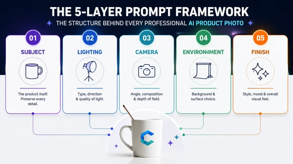
Layer 1 — Subject. The product itself: exact material, color, shape, and any text or logo it carries. If you’re editing a real photo, this layer also includes the instruction to preserve those details exactly rather than reinterpret them.
Layer 2 — Lighting. The type, direction, and quality of light. “Good lighting” means nothing to a model; “soft overhead studio light with a gentle front fill” means something specific.
Layer 3 — Camera & Composition. The angle, framing, and depth of field. Think in terms a photographer would use: eye-level, 45-degree, overhead flat lay, macro close-up, shallow depth of field.
Layer 4 — Environment & Surface. The background and any surface the product sits on or against — seamless paper, marble, linen, wood grain, or a real-world setting.
Layer 5 — Finish & Mood. The overall style: clean commercial, moody editorial, warm lifestyle. This is the layer that makes a photo feel like your brand rather than a generic stock image.
Here’s the difference those five layers make on the same object — a plain ceramic coffee mug:
Weak: “Nice product photo of a coffee mug.”
Improved:
“Using the uploaded photo as the exact reference, photograph the matte black ceramic mug on a warm oak wood surface. Soft morning window light from the left, gentle shadow falling to the right. Eye-level, 45-degree angle, shallow depth of field with the handle in sharp focus. Background softly blurred, out-of-focus warm kitchen tones. Cozy, minimal commercial mood, no steam, no added props.”
Notice that every layer in the improved version answers a question the weak version leaves open. That gap is exactly where the categories below differ from each other — each product type has one layer that matters far more than the rest, and that’s the layer this guide focuses on for each one.
The One Rule That Matters More Than Any Prompt: Anchor to a Real Photo
This is the piece of advice most prompt lists leave out, and it’s the one that actually protects your sales. When you generate a product image from a text description alone, the AI invents the product’s exact color, proportions, and label placement from scratch — and it will get at least one of them wrong more often than sellers expect.
Independent testing gives a sense of how common this is. Photoroom’s Product Fidelity Benchmark, which ran 3,400 AI-edited generations across 850 real products, found that logo and text distortion was the single most frequent failure — showing up in roughly one out of every five generations — followed by missing product details and altered patterns or design elements. These aren’t obviously “AI-looking” mistakes; the image can look completely convincing while showing a wrong product.
The fix is simple and non-negotiable for anything you’re actually going to sell: always start from a real photo of your real product, and instruct the model to edit around it rather than regenerate it. Keep this preservation clause handy and paste it into any prompt where accuracy matters:
Preserve the product’s exact shape, proportions, color, material, logo, and any printed text with zero reinterpretation. Do not add, remove, or redesign any element of the product itself. Only change what is explicitly instructed below.
Before you publish anything, zoom in on the label and logo at 100%. That ten-second check catches the failure type that shows up most often. It’s also worth knowing that marketplaces are drawing an increasingly sharp line between AI editing a photo of a real item you already have and AI generating a product that doesn’t exist yet — the first is broadly accepted, the second runs into policy trouble in a growing number of places, and the exact line moves depending on the platform. Every formula below is built around the first approach for exactly that reason.
Prompt Formulas by Product Category
Generic prompts produce generic — and often inaccurate — results, because “product photography” isn’t one skill. Photographing a ring and photographing a couch have almost nothing in common. Each formula below leads with the one detail that makes that category different, so you can see at a glance what actually changes from product to product, and closes with the other items each formula quietly works for.
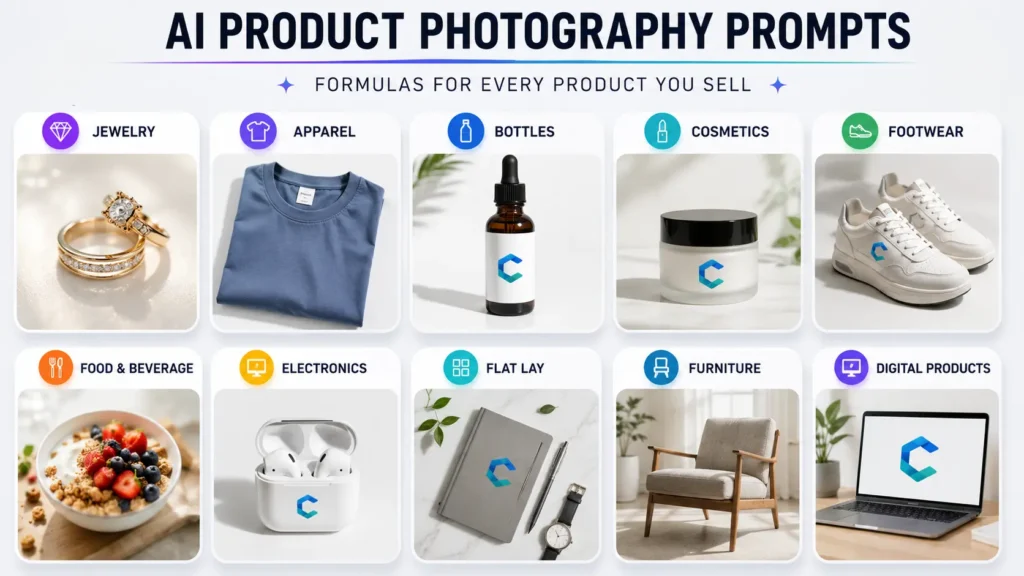
Jewelry, Watches & Small Metal Accessories — The Macro Detail Formula
The detail that matters most: reflections. Polished metal reflects everything around it, including the room, the camera, and whoever’s holding the phone — left uncontrolled, that’s what makes an otherwise sharp photo look amateur.
Prompt to use:
Using the uploaded photo as the exact reference, photograph the gold pendant necklace on a matte white acrylic riser. Soft diffused overhead lighting with a small white reflector card camera-left to lift shadow without creating a second hotspot. Macro angle, shallow depth of field, focus locked on the pendant. Background: seamless pale grey paper, softly out of focus. Preserve the exact metal tone and finish from the reference — no gold-tone shift, no added sparkle effects. Clean, minimal commercial jewelry photography, subtle specular highlights only, no props, no text.
Also works for: coins and medals, enamel pins, keychains, cufflinks, small hardware, phone charms, watch faces shot solo.
Apparel Worn On the Body — The Ghost Mannequin Formula
The detail that matters most: showing fit and drape without a visible person or mannequin. “Ghost mannequin” is a real fashion-photography technique — the garment holds natural body-shaped volume, but nothing wearing it is visible, including inside the collar.
Prompt to use:
Using the uploaded photo as the exact reference for fabric color, print, and fit, apply an invisible mannequin (ghost mannequin) effect: the garment holds natural body-shaped volume and drape as if worn, with the neckline interior visible and no mannequin, model, stand, or hanger present anywhere in frame. Soft, even studio lighting from the front, minimal shadow. Centered on a seamless white background, eye-level angle, garment filling most of the frame. Preserve every printed graphic, logo, and seam exactly as shown in the reference photo.
Also works for: bags shown worn cross-body or on the shoulder, scarves draped with natural fold, hats holding their crown shape, backpacks shown worn. Selling the item folded or laid flat instead — a t-shirt, a tote, a printed blanket? Drop the ghost-mannequin instruction entirely and use the Flat-Lay formula further down; the same preservation clause for graphics and logos still applies.
Bottles, Jars, Candles & Curved Labels — The Bottle & Label Formula
The detail that matters most: curved, often glossy surfaces bend light unpredictably, and a single hotspot can wash out the exact label text a customer needs to read.
Prompt to use:
Using the uploaded photo as the exact reference for the bottle shape, cap, and label artwork, photograph it on a matte white surface with soft, even lighting positioned to avoid harsh glare or hotspots on the curved surface. Label text must remain letter-perfect and fully legible, matching the reference exactly — no reinterpretation of fonts, wording, or layout. Eye-level angle, label facing camera. Subtle, realistic reflection on the surface below only if the surface is glossy. Clean commercial product photography, true color accuracy.
Also works for: candles in glass jars (light the wick area gently, don’t imply it’s lit unless it is), supplement and pill bottles, sauces and condiments, perfume, lotion pumps, wine and spirit bottles.
Cosmetics & Color-Critical Products — The True-Color Formula
The detail that matters most: color accuracy isn’t a nice-to-have here, it’s the entire sale. AI models tend to default toward richer, more saturated color unless told otherwise — flattering for most products, but a direct cause of wrong-shade returns for anything where the color in the photo is the thing being bought.
Prompt to use:
Using the uploaded photo as the exact reference for the product’s true shade, do not increase saturation, warmth, or contrast beyond what the reference shows — the color a buyer sees must match what’s inside the packaging exactly. Photograph the open product next to its closed case on a matte white surface, soft diffused lighting with no warm color cast. Eye-level angle, shallow depth of field focused on the product’s tip or applicator. Include a small swatch of the actual color on the same surface so the true shade is unmistakable. Clean, true-to-life commercial beauty photography.
Also works for: paint sample chips, yarn and embroidery thread, fabric and upholstery swatches, nail polish, ink and stationery colors — any product where the purchase decision hinges on matching a specific shade.
Footwear & Paired Products — The Paired Product Formula
The detail that matters most: shoes are conventionally shown as a pair, angled to reveal both the side profile and a hint of the sole — buyers check tread and construction, not just the upper.
Prompt to use:
Using the uploaded photo as the exact reference for the shoe’s exact colorway, materials, and logo placement, photograph the pair together: one shoe angled to show its outer side profile fully, the second positioned just behind and slightly overlapping to reveal a hint of its sole tread. Soft overhead studio lighting with a fill card so the sole’s underside stays visible without blowing out highlights. Seamless white background, both shoes casting a matching soft contact shadow. Eye-level, slightly elevated angle. Laces, stitching, and logo reproduced exactly as shown in the reference — no altered colorway.
Also works for: gloves, sunglasses, earring pairs, sandals and flip-flops — anything customers expect to see as a matched set rather than a single unit.
Food & Beverage — The Appetite Appeal Formula
The detail that matters most: freshness cues. AI models tend to over-smooth food texture in a way that reads as artificial — the opposite of appetizing — so the prompt needs to actively protect texture, not just describe the dish.
Prompt to use:
Using the uploaded photo as the exact reference for the dish’s real ingredients, plating, and portion size, photograph it from a 45-degree angle on a dark slate surface. Warm, soft natural side light, gentle steam rising if the dish is served hot. Shallow depth of field, focus locked on the garnish or key ingredient in the foreground. Preserve the food’s real texture — do not smooth, glaze, or over-polish the surface in a way that looks artificial. Natural, appetizing color grading, no added utensils unless they’re in the reference photo.
Also works for: baked goods, pet treats, coffee and tea drinks, cocktails and bar photography, restaurant menu shots.
Electronics & Reflective Hard-Surface Items — The Controlled Reflection Formula
The detail that matters most: glass, glossy plastic, and brushed metal reflect the studio itself. Left unmanaged, you get the light source, the camera, or the photographer showing up in the shot.
Prompt to use:
Using the uploaded photo as the exact reference for the device’s exact color, finish, and port placement, photograph it on a matte surface with large, soft diffused lighting positioned to avoid a hard reflection of the light source on the screen or glass. If the screen is on, keep the displayed content simple and legible — a plain home screen or a single static image, not blurred or invented interface elements. Eye-level, three-quarter angle to show the device’s depth. Subtle, realistic ambient reflection only — no visible studio equipment or camera reflected in any glossy surface.
Also works for: kitchen appliances, mirrors, glossy furniture finishes, sunglasses lenses, glass cookware.
Multi-Item Sets, Flat Lays & Gift Bundles — The Flat-Lay Formula
The detail that matters most: every item has to read as an individual product. Overlapping edges or merged shadows make a set look like a blur instead of a list of things you get.
Prompt to use:
Overhead flat-lay composition of [list each item by name], arranged with clear space between each piece so nothing overlaps. Soft, even top-down diffused lighting, no harsh shadows. Background: seamless neutral paper or light linen fabric. Each item’s true color and proportion preserved exactly as photographed. Centered, loosely balanced arrangement, clean commercial styling, no added props beyond what’s listed.
Also works for: subscription boxes, stationery bundles, cosmetic gift sets, holiday or seasonal bundles.
Furniture & Large Home Goods — The Lifestyle Context Formula
The detail that matters most: scale. A couch photographed alone against white gives no sense of size — for large items, context sells the product better than isolation does.
Prompt to use:
Using the uploaded photo as the exact reference for the piece’s design, material, and finish, place it in a realistically scaled living room setting with natural window light from the left, soft shadows. Camera at a slightly elevated eye-level angle to show proportion against the room. Warm, neutral color grading, uncluttered styling with one or two simple props for scale reference. The product itself must remain exactly as shown in the reference — do not alter its shape, color, or materials.
Also works for: rugs, wall art, large mirrors, planters, outdoor furniture.
Digital Products & Mockup Insertion — The Mockup Composite Formula
The detail that matters most: this isn’t lighting a physical object at all — it’s compositing a flat design into a believable scene, so the source file needs to survive the process pixel-for-pixel, not just “look similar.”
Prompt to use:
Using the uploaded artwork file as the exact reference for the design, composite it into a thin black wooden frame hung on a lightly textured plaster wall, viewed straight-on with soft ambient room light. Preserve the artwork’s exact colors, proportions, and every design detail with zero reinterpretation — no cropping, recoloring, or redrawing any part of it. Soft, natural shadow beneath the frame. Minimal, gallery-style styling, no other wall decor in frame.
Also works for: printable planners and journals shown on a tablet, digital wall art, phone lock-screen previews, embroidery or cross-stitch pattern previews — anything where a flat file needs to look like it’s sitting in the real world.
Keeping One Product Consistent Across a Full Catalog Shoot
A single great photo is easy. The real business problem is a set — front, back, detail, and lifestyle shots that all look like they came from the same shoot, for every SKU you carry. This is where AI product photography most often fails sellers: lighting warms up, the angle drifts, and by the fifth image the set no longer reads as one product line.
The fix uses the same five-layer discipline this whole guide is built on: treat Layers 1 through 3 as fixed and only change Layer 4 between shots. Keep the exact same subject-description and lighting language across every prompt in a set, reuse the same uploaded reference photo for each generation, and vary only the background or context. Gemini 3 Pro Image can blend multiple reference images in one request and hold a consistent subject across the output, and ChatGPT’s image tool can generate a set of coherent variations from a single prompt while keeping the object stable — both are built for exactly this multi-shot consistency problem.
The same discipline is what makes a formula portable to a product it wasn’t written for, which is the whole idea behind the “also works for” notes above: Layer 1 changes to describe the new product, Layer 4 changes if the setting doesn’t fit, and Layers 2, 3, and 5 usually carry over untouched, because lighting quality and camera logic don’t actually care what the subject is.
Troubleshooting: Fixing the Most Common AI Product Photo Failures
Logo or label text comes out warped or misspelled. This is the single most common failure across AI product photography. Always work from a real reference photo rather than a text description, add the preservation clause above, and zoom in at 100% before publishing — don’t judge accuracy from the thumbnail.
The product’s color looks slightly off. Describe the color precisely rather than generically (“warm terracotta orange,” not just “orange”), and make small color corrections through a targeted edit instruction rather than a full regeneration, which risks changing other details you didn’t want touched.
A multi-image set doesn’t look like it came from one shoot. Keep your subject and lighting language identical across every prompt in the set and only vary the background layer — see the consistency section above.
Shape or proportions look subtly wrong. This usually traces back to the source photo, not the prompt. Use a sharp, well-lit, uncropped photo shot roughly straight-on; extreme angles or blurry source images give the model less to anchor to.
The model adds fake text, badges, or claims to the image. Never ask an AI tool to add marketing copy, certifications, or promotional badges directly into the product image — beyond the accuracy risk, unsupported claims baked into an image can create real compliance problems. Add that kind of text in your listing design tool instead, where you control it directly.
If you’re building out prompt sets for a full catalog and want a head start rather than writing every formula from scratch, the prompt packs in our Gumroad shop are organized the same way as the formulas above — by product type, reference-anchored — so you can drop in your own photos and go straight to editing.
Frequently Asked Questions
1. Can I use the same prompt formula for a completely different product?
Yes — that’s the entire point of building prompts in five layers instead of one block of text. Swap the product description in Layer 1 and adjust the setting in Layer 4, and the lighting and camera language in Layers 2 and 3 usually carries over untouched. A jewelry formula adapted this way works for pins or keychains; a bottle formula adapts to candles or sauces. The “also works for” notes under each formula above are a starting list, not the limit.
2. Can I use fully AI-generated, rather than AI-edited, product images on marketplaces?
Policies differ by platform and are actively being updated, so there’s no single answer that holds everywhere. The safer approach regardless of platform is to always generate from a real photo of your actual product rather than a text description alone, and to check your specific marketplace’s current AI-content policy before a bulk upload.
3. Which detail matters most for accuracy, across every category in this guide?
Text and logo reproduction. It’s the most common failure point in AI-edited product photography by a wide margin, which is why every formula above includes an explicit instruction to preserve printed details exactly rather than let the model reinterpret them, and why a 100% zoom check before publishing is worth the ten seconds it takes.
4. How do I keep a product looking consistent across a full set of catalog photos?
Reuse the same reference photo and keep your subject and lighting instructions identical across every prompt in the set, changing only the background or context layer between shots. Generating the set together, using a tool built for multi-image consistency, produces more uniform results than running each angle as a separate, disconnected prompt.
5. Will AI-generated product photos hurt my conversion rate compared to real photography?
Not if the image accurately represents your product — buyers respond to clear, well-lit, trustworthy photos regardless of how they were made. The real risk to conversion, and to returns, is an image that looks polished but shows the wrong color, logo, or proportions, which is why reference-anchored editing and a pre-publish accuracy check matter more than which tool you use.
6. Can AI accurately reproduce my exact logo and label text?
It can, but not automatically. Anchor every generation to a real photo of your actual label, add an explicit instruction to preserve text and logo details with zero reinterpretation, and always zoom in to check the result before publishing — logo and text distortion is the most common accuracy failure in AI-edited product photography.