The Visual Logic Behind Each Style — and Why AI Gets It Wrong Without Direction
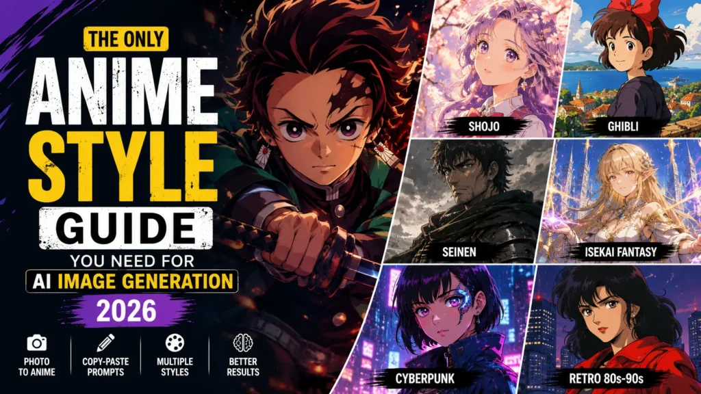
There is a specific frustration that comes from typing “anime style” into an AI tool and watching it produce something that looks like a generic cartoon with large eyes.
The image is technically anime. But it is not the anime you imagined.
This happens because most people treat “anime” as a single visual style when it is actually a collection of completely different traditions — each with its own colour logic, character design rules, and emotional register. Shonen and shojo are both anime. So are Berserk and Chibi. They look nothing alike.
The AI is not guessing wrong. It is just averaging across everything it knows about anime because you did not tell it which version you wanted. The fix is simpler than most people expect: name the sub-style precisely, and the output changes immediately.
This guide breaks down the styles that matter most for AI image generation, with prompts you can copy and adjust for each one.
Try Our AI Tools on Qlexia
Professional AI tools for creators, marketers, and businesses.
Why the Style Name Changes Everything
When you add a specific anime style to your prompt, you are not just adding a label. You are activating a set of learned visual associations — line weight, colour temperature, character proportions, background complexity, lighting approach — that the model uses to shape the entire image.
The difference between “anime warrior” and “shonen anime warrior, bold ink lines, speed lines, high-contrast saturated palette” is not minor. It is the difference between a forgettable output and one that actually looks intentional.
Each style below includes what makes it visually distinct, where it tends to fail without the right prompt guidance, and a ready-to-use prompt that reflects those specifics.
Shonen
The visual logic: Everything in shonen is designed to feel kinetic. Characters lean forward, hair blows backward, and the background becomes motion itself — speed lines, explosion bursts, atmospheric dust. The colour palette runs hot and saturated. Line work is heavy, confident, and unapologetic.
Where AI goes wrong with it: Without clear direction, the output looks lively but flat — like a character standing against a neutral background wearing generic armour. The energy that defines shonen comes from the environment interacting with the character, and that needs to be in the prompt.
Prompt to try:
Male warrior mid-leap in a battle stance, shonen anime style, spiky dark hair, fierce glowing eyes, torn fighting clothes, speed lines radiating from the figure, bold heavy ink lines, vibrant saturated colours, high-contrast dynamic lighting, full-body composition
Try it with your image: Upload your photo and add — Keep my face. Transform me into a shonen anime character with an intense battle-ready expression, dramatic speed line background, bold ink style.
Shojo
The visual logic: Shojo operates on softness and emotional resonance. The palette is pastel — pinks, lavenders, soft golds. Eyes are large and luminous, often containing multiple stacked light reflections. The environment participates in the emotion: flowers bloom, light flares appear, petals fall on cue. Nothing is harsh.
Where AI goes wrong with it: Shojo prompts without palette guidance tend to drift toward a generic “cute girl” aesthetic that is close but not right — usually too bright, too flat, missing the dreamy haziness that defines the style.
Prompt to try:
Young woman with large luminous eyes and long flowing hair, shojo anime style, soft pastel palette, pink and lavender tones, falling cherry blossom petals, sparkle light effects, gentle close-up portrait, soft painterly finish, dreamy romantic atmosphere
Try it with your image: Upload your photo and add — Convert this into a shojo anime portrait. Keep my facial features but give me large sparkling eyes, pastel colour palette, and a soft floral or light-flare background.
Studio Ghibli
The visual logic: Ghibli does something unusual — it invests more detail in the world than in its characters. The environments are painted with a warmth and specificity that makes them feel inhabited. Characters are simple, rounded, and approachable. The light source is almost always warm and directional, evoking late afternoon or golden hour. The feeling is nostalgic before you even register why.
Where AI goes wrong with it: This style needs the environment to carry the weight. If your prompt focuses mostly on the character, the background ends up generic and the Ghibli quality disappears. The landscape needs to be described as carefully as the person in it.
Prompt to try:
A young person standing in a sunlit meadow, Studio Ghibli inspired art style, lush hand-painted green landscape with wildflowers in the foreground, warm golden afternoon light, softly detailed clouds, gentle wind movement, painterly quality, wide-angle composition, nostalgic and peaceful mood
Try it with your image: Upload your photo and add — Transform this photo in Studio Ghibli style. Keep my likeness but make everything painterly and warm. Place me in a Ghibli-style natural landscape — countryside, forest, or coastal town. Warm golden light, detailed background.
Seinen
The visual logic: Seinen is what anime looks like when it removes the spectacle. Proportions become more realistic. The colour palette pulls back — dark greens, charcoal, muted browns, deep grey-blues. Lighting is cinematic and directional rather than flat and illustrative. Nothing is exaggerated for effect. The result is weight — visual, emotional, tonal.
Where AI goes wrong with it: AI models default toward higher saturation and sharper contrast because those qualities generally “look good.” Seinen requires you to push back on that explicitly. Without the instruction to desaturate and restrain, you get a darker-looking shonen, not seinen.
Prompt to try:
Battle-worn adult soldier with tired eyes and a scarred face, mature seinen anime style, muted desaturated colour palette, dark greens and charcoal tones, dramatic directional side lighting, realistic facial proportions, detailed worn armour, cinematic close-up composition, heavy atmosphere
Isekai Fantasy
The visual logic: Isekai lands somewhere between high-energy anime character design and detailed fantasy illustration. Characters wear ornate armour or robes with visible embroidery and jewel work. Magic effects — particle light, glowing runes, spell circles — add visual complexity. The environments push toward dramatic scale: castle towers, ancient forests, storm-lit skies.
Where AI goes wrong with it: Generic fantasy prompts produce characters that look European medieval rather than anime. The distinction is in the specificity of the fantasy elements — the glowing effects, the elaborate costume detail, the sense of game-world scale — all of which need to be in the prompt.
Prompt: to try
Female mage in ornate layered fantasy robes casting a glowing blue and gold spell, isekai anime fantasy style, detailed embroidered fabric and jewel accessories, magical particle light effects, enchanted ancient forest at night in the background, RPG illustration quality, vivid and detailed
Try it with your image: Upload your photo and add — Transform this into an isekai fantasy anime character. Keep my face. Give me elaborate fantasy armour or robes, glowing magical effects, and place me in a dramatic fantasy landscape.
Cyberpunk Anime
The visual logic: This style has a very specific recipe that AI tools handle well when given the right signals: neon light reflecting off rain-wet pavement, towering city infrastructure at night, characters with visible cybernetic modifications, and a tight colour palette of deep purples, electric teals, and cold blues. The mood is simultaneously thrilling and bleak.
Where AI goes wrong with it: Cyberpunk prompts without colour anchoring tend toward a generic sci-fi look — grey and silver — rather than the vivid neon-drenched atmosphere the style requires. The colour palette is the style here more than anything else.
Prompt to try:
Female hacker with a glowing cybernetic eye and mechanical arm, cyberpunk anime style, rain-soaked neon megacity at night behind her, purple and electric teal lighting, wet street reflections, futuristic jacket with holographic panels, atmospheric fog and neon signage, cinematic portrait framing
Try it with your image: Upload your photo and add — Turn this into a cyberpunk anime character. Keep my face. Give me a cybernetic eye, futuristic clothing, and place me in a neon-lit rainy city at night. Purple and teal colour palette.
Retro 80s–90s Anime
The visual logic: This style is currently one of the most requested looks in AI art communities, and the appeal is easy to understand — it looks deliberate in a way that polished modern AI art often does not. The signature elements are cel-shaded flat colour fills without digital gradients, slightly rough ink lines, a warm faded colour palette, and film grain that makes the image feel like it came from a VHS tape.
Where AI goes wrong with it: The model’s instinct is toward smoothness. The grain, the flat fills, the rough linework all need to be requested directly. Without them, you get a modern anime image with warm colours — close, but missing the texture that makes the vintage style feel authentic.
Prompt to try:
Female action hero in a fighting stance, retro 1980s anime style, cel-shaded flat colour fills with no gradients, warm faded vintage colour palette, visible film grain texture, thick rough ink lines, slightly hand-drawn quality, Japanese animation poster aesthetic from the 1980s
Three Prompt Habits That Apply to Every Style
After the style name, these three additions consistently improve output quality across all anime styles:
Describe the light source. “Dramatic side lighting,” “warm golden afternoon light,” “neon backlit glow,” “soft diffused window light” — lighting defines mood more than almost anything else, and leaving it unspecified means the AI defaults to whatever is most common in its training data.
Give the composition a shape. “Close-up portrait,” “full-body shot,” “wide landscape,” “over-the-shoulder view” — this tells the AI where to place the camera relative to the subject, and it changes the entire feeling of the image.
State what should not change if you are using a photo. For photo transformations, being explicit about preservation — keep my facial features, keep my hair colour, keep the original composition — dramatically improves how much of the source image survives the transformation.
The gap between a generic AI anime image and one that looks like it came from an actual studio is almost entirely a prompting gap. Pick the style that matches what you are building toward, copy the prompt, and treat it as a starting point rather than a final answer — every adjustment you make from there will teach you something new about how that style actually works.
FAQs
1. Can you mix two anime styles in one AI prompt — and will it actually work?
Yes, but the result depends on how different the two styles are from each other. Styles that share visual logic tend to blend well — for example, isekai fantasy and shojo both use detailed costume work and soft environmental lighting, so combining them in one prompt usually produces something coherent. On the other hand, mixing styles with conflicting visual rules — like chibi (simplified proportions) and seinen (realistic proportions) — tends to produce distorted results because the model receives contradictory signals about how to draw the character’s body.
The safest approach is to assign one style to the character and the other to the environment. For instance: “shonen character design in a Studio Ghibli painted landscape” lets each style do what it does best without fighting over the same visual elements.
2. Why does my anime AI art look different every time, even when I use the same prompt?
AI image generation is not deterministic by default — each generation introduces randomness even with identical prompts. This is intentional, but it means your character’s face, hair, and proportions can shift noticeably between runs.
The most reliable fix is to lock the seed number when your tool supports it. The seed is a value that controls the starting point of the generation process. Using the same seed with the same prompt produces near-identical results. In Midjourney, you add --seed [number] to your prompt. In Stable Diffusion-based tools, the seed field is visible in the settings panel.
If your tool does not support seeds (ChatGPT and Gemini do not currently expose seed control), the next best option is to save your best-performing image and use it as a reference image in subsequent generations — most tools accept an image reference that anchors the character’s appearance even as the pose or scene changes.
3. Why does “Studio Ghibli style” work in some AI tools but not others?
The difference comes down to how each tool handles copyright-adjacent style references. Studio Ghibli is a trademarked studio, and some tools — particularly those with stricter content policies — have been trained to decline or soften outputs that directly reference trademarked brands. ChatGPT had a well-publicised period in 2025 where it heavily restricted Ghibli-style outputs before adjusting its approach.
If a tool declines “Studio Ghibli style,” the workaround is to describe the visual elements instead of naming the studio: “soft painterly background, warm golden landscape, hand-drawn natural environment, rounded simple character design, nostalgic watercolour quality.” This describes the aesthetic without triggering brand-related restrictions, and in most cases produces results that are visually very close to what you were after.
4. Does the anime style I choose affect how well the AI draws faces and hands?
Yes — significantly. Some anime styles are more forgiving of AI’s known limitations with complex anatomy than others.
Chibi style, for example, drastically simplifies hands into rounded shapes and reduces facial detail to large eyes and minimal features. This actually works in your favour with AI, because the model has less to get wrong. Shojo style similarly uses large, simplified eyes that AI handles well.
The styles that tend to produce the most anatomical errors are those that demand realistic detail — seinen and mature fantasy styles that require accurate hand anatomy, proper finger count, and realistic proportions. If you are generating images in these styles and anatomy is coming out wrong, the most effective prompt additions are: “correct hand anatomy, five fingers, detailed realistic hands” and a negative prompt (where your tool supports it) of “extra fingers, fused hands, deformed hands.”
5. Can I use these anime style prompts in ChatGPT and Gemini, or only in dedicated AI art tools?
All the prompts in this guide work in ChatGPT (with image generation enabled), Gemini, Midjourney, Leonardo AI, and most other major tools. The style keywords are widely understood across platforms.
The main difference is in the level of control each tool gives you. Midjourney and Stable Diffusion-based tools let you fine-tune outputs with parameters like aspect ratio, seed locking, and style strength sliders. ChatGPT and Gemini work more conversationally — you describe what you want in plain language, and the model interprets it. For photo-to-anime transformations specifically, ChatGPT currently produces the most consistent face-preserving results of any free tool, while Midjourney Niji 6 produces the highest pure anime art quality for text-to-image generation.

I realized that naming the sub-style precisely—like ‘shonen fight scene’ instead of just ‘anime’—immediately fixed the messy outputs I was getting. It’s like specifying a barcode symbology to avoid scanning errors.
Great point — naming the sub-style precisely really does make a difference. Broad tags like “anime” can confuse the model, but specifying something like “shonen fight scene” gives it clear visual cues, just like your barcode analogy. Thanks for sharing that insight!